Data Visualization: A Walkthrough in Python
Overview
Teaching: 10 min
Exercises: 60 minQuestions
How can we take an existing visualization and build an improved version in Python?
Objectives
Apply the visualization principles learned during the first half to a practical problem.
Familiarize yourself with matplotlib
Data Visualization: A Walkthrough
This notebook takes an existing data visualization and aims to improve it based in some principles of good design.
Here’s the original data visualization:
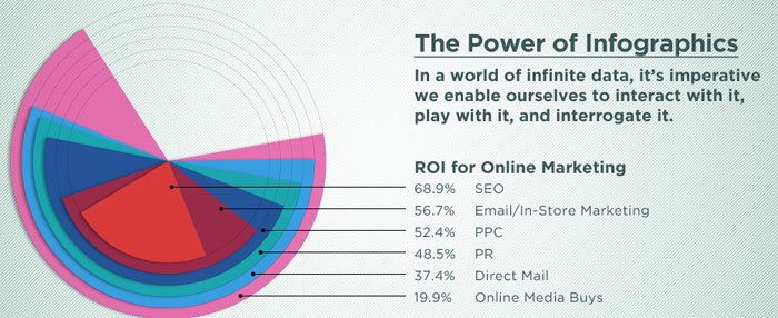
Some internet business terminology to keep track of (or not):
- “ROI” = “Return on Investment”, i.e. how much profit you get back after spending some money on advertising
- “SEO” = “Search Engine Optimization”, the process of tweaking your website so that it appears far on top in search engines like Google or DuckDuckGo
- “PPC” = “Pay-per-click” is an internet advertising model used to drive traffic to websites, in which an advertiser pays a publisher (typically a search engine, website owner, or a network of websites) when the ad is clicked (as per wikipedia
- “PR” = “Public Relations”, is a strategic communication process that builds mutually beneficial relationships between organisations and the public, as per this website
- “Direct Mail”: good old-fashioned snail mail advertising you get in the post
- “Online Media Buys”: refers to matching an advertisement to an intended audience, I think. See also wikipedia
Exercise: Write down short statements regarding the following questions
- When you first looked at the figure, what did you first study: the visualization or the text?
- What key point do you think the data visualzation is meant to convey?
- How well does the type of data visualization and its physical appearance (form, colours, contrast etc) convey the information given in the text?
- What alternative forms might you choose to represent the data?
Note: This a data visualization exercise, not one in internet marketing. If some of those terms don’t make sense do you, that’s totally okay. If you can’t figure out what the figure is trying to tell you (honestly, I’m not sure, either), that’s fine, too! For a data visualization exercise like this, you can totally make up a message you want to bring across (in fact, I’m going to do exactly that further down below) and run with it. In reality, we’re scientists, however, and we don’t make up stories in general. In your work, you might be faced with two situations:
- Exploratory data analysis: Often, data visualization is a key part of exploratory data analysis, where you encounter a new data set and you don’t know yet what’s in there. For example, data from a new telescope might contain systematic effects that lead to funny-looking data. Visualizing the data sets helps you figure out what your data looks like, what biases might be in it.
- Explaining a result with a visualization: In our scientific (or non-scientific!) publications, we often use visualizations to explain a scientific result. In these cases, we already know the story, our scientific result, so in this case our task is to make sure that our visualization (1) represents the data accurately (everything else would be lying), and (2) that it allows the viewer to understand your results and how you’ve arrived there.
Data Visualization Libraries
There are many different data visualization libraries out there in many different languages! For example d3.js has become very popular in the online world to make interactive visualizations and websites. D3 has a pretty steep learning curve, though, and you need to know some JavaScript first. If you do, you can build amazing things, though. The New York Times has a fantastic data visualization team, have a look for example at their 2018 Year in Graphics.
But even within Python, which we’re using here, there’s a large number of libraries, and it can be difficult to choose which one might fulfil your purpose best. Here, we are going to work with matplotlib and seaborn, but we encourage you to recreate this notebook (or go a different route!) with another language and/or package.
The version you see on the website is a Markdown version (Markdown is a document language) of a Jupyter Notebook. You can find this notebook in the /code/ folder of the repository under the name 12-walkthrough.ipynb, if you want to download and execute the code yourself. However, I would also encourage you to create your own notebook and type the commands yourself, and edit them as you go to try new things. You’ll probably learn more that way!
So let’s get started by importing some libraries:
# show plots inline
%matplotlib inline

# import matplotlib and seaborn
import matplotlib.pyplot as plt
import seaborn as sns

# some style choices I like
sns.set_style("whitegrid") # include grid, white background
sns.set_context("talk") # larger text sizes by default
The data
Let’s copy the data from the figure. This is easy, since the information was printed right next to the figure. As an aside: there may be good reasons to include the data the visualization is drawn from within a figure. However, when you need to include the data as the only way to make your data visualization legible, you may want to think whether there is a better way to visualize the data than your current choice.
Let’s first import some libraries and then make a pandas Series with our data:
import numpy as np
import pandas as pd
d = {"SEO": 68.9, "Email": 56.7, "PPC": 52.4, "PR": 48.5, "Direct Mail": 37.4, "OMB": 19.9}

df = pd.Series(d)
df
Direct Mail    37.4
Email          56.7
OMB            19.9
PPC            52.4
PR             48.5
SEO            68.9
dtype: float64
Choosing a Visualization Type
One of the key choices to make for visualizing data is the type of data visualization. Which data visualization you choose is a matter of the function of your visualization and the type of your data. Are you showing fractional pieces of a whole? Are you comparing a quantity between different data sets? Do you have data as a function of time or wavelength?
One great resource is the data visualization catalogue. It’s basically a library of different types of data visualizations, each with a description, what it’s often used for, and what the potential pitfalls are. One useful way to sort this catalogue is by function, which can be helpful in defining what it is you need.
Exercise: Go back to your answers to the questions above, and use the data visualization catalogue to find a type of data visualization that might represent the data above more clearly.
Our example figure is a particular form of pie chart. Pie charts are often used to represent fractions of a whole. While they’re often not as bad as their reputation, in this case, they’re not a good way to visualize the data. For a pie chart to work, the different data entries must add up to 100%. As is very clear above, this is not the case, which is presumably why the graphic designer chose to nest the different pie slices. The problem whith this is that you can’t really tell anything about the slices behind the first one, except that some are bigger than others, and it’s hard to track which slice belongs to which data entry (you may or may not have noticed that the smallest slice actually connects to the largest number, and the largest slice connects to the smallest number).
So what’s a better way to present this data? Something that’s definitely true for data visualization: simple is often better. So let’s do a bar chart instead:
df.index
Index(['Direct Mail', 'Email', 'OMB', 'PPC', 'PR', 'SEO'], dtype='object')
# set up the plot
fig = plt.subplots(1, 1, figsize=(6,4))

# make the bar chart
sns.barplot(x=df.index, y=df.values)
<matplotlib.axes._subplots.AxesSubplot at 0x10be249e8>

This figure immediately gives you more information about the data than the previous version did. In particular, it’s immediately clear which bar belongs to which entry without confusing lines connecting them, and the order is also immediately clear: SEO has the largest return-on-investment, Online Media Buys the smallest.
Without having the numbers printed on the figure, you can still fairly easily read off the approximate value of those numbers from the axes. In this case, I would only include the numbers on the figure if they’re crucially important to the narrative of the figure.
Colour
Let’s talk about colour! Along with shape and type, this is one of the most important decisions you can make. One reason for this is that recognizing things by colour is a pre-attentive task: your brain can perform it in the span of less than a hundred milliseconds, without you having to consciously think about it! That means colour is an important tool to guide your viewer in the right direction, but it can also confuse a lot.
Let’s say our narrative is that e-mail advertising is almost as effective as Search Engine Optimization (maybe because it’s much cheaper, and we’re trying to convince someone to put some money in it).
In the figure above, each bar is a different colour. Moreover, all the colours are similarly weighted (they’re equally opaque, and have similar visual weights). This sort of implies that they’re all equally important, and the colour itself conveys no useful information. It more detracts from the information than it adds.
So let’s use colour a little more mindfully:
# make the bar chart
sns.barplot(x=df.index, y=df.values, color="darkblue")
<matplotlib.axes._subplots.AxesSubplot at 0x11187a048>

We can use the gestalt concept of continuity to order this by y height. This allows us to decipher the plot information quicker.
df.sort_values(inplace=True, ascending=False)
df
SEO            68.9
Email          56.7
PPC            52.4
PR             48.5
Direct Mail    37.4
OMB            19.9
dtype: float64
# make the bar chart
sns.barplot(x=df.index, y=df.values, color="darkblue")
<matplotlib.axes._subplots.AxesSubplot at 0x1a157a3a58>

This is much more boring, but much less confusing. We can color the bars by another dimension to convey more information, let’s say here we want to color them by height. We do this by using a sequential color palette. This still allows the red bar to jump out, and gives some weight to the remaining bars.
sns.palplot(sns.color_palette("Blues"))

# make the bar chart
sns.barplot(x=df.index, y=df.values, palette="Blues")
<matplotlib.axes._subplots.AxesSubplot at 0x1075765c0>

Now perhaps, instead, we’d actually want to highlight the e-mail data point.
We can do this in seaborn by not passing a single colour, but passing a colour for each bar separately:
colours = ["darkblue", "red", "darkblue", "darkblue", "darkblue", "darkblue"]
# make the bar chart
sns.barplot(x=df.index, y=df.values, palette=colours)
<matplotlib.axes._subplots.AxesSubplot at 0x1a15a540f0>

Now the red bar immediately jumps out, doesn’t it? However, the bars are still of a similar visual weight. This might not be ideal, for example if the figure is printed in greyscale, where very different colours might come out very similarly.
Another important consideration is colour blindness.
Here’s the sampe plot above in red and green:
bad_colours = ["green", "red", "green", "green", "green", "green"]

# make the bar chart
sns.barplot(x=df.index, y=df.values, palette=bad_colours)
<matplotlib.axes._subplots.AxesSubplot at 0x1a15ad0780>

And here is simulation of the same figure for deuteranopia, the most common kind of colour blindness:

The best way to make this figure readable in both greyscale and to people with colour blindness is to not rely on colour alone for distinguishing elements. For example, you can also rely on intensity:
colours = ["lightgreen", "darkred", "lightgreen", "lightgreen", "lightgreen", "lightgreen"]

# make the bar chart
sns.barplot(x=df.index, y=df.values, palette=colours)
<matplotlib.axes._subplots.AxesSubplot at 0x1a15aacb38>

Or you can change the shape (e.g. in the case of a scatter plot), make the bars slightly transparent (which is strictly also a change in intensity), or include some kind of other pattern that will distinguish your important elements from the rest.
Note that in everything you do, contrast is important, not only but especially for readers with vision deficiencies. Make sure that there is always sufficient contrast in those elements of your plot that are crucial for readers to understand the message conveyed in it.
There are a number of great tools out there to check for things like contrast and colour combinations. I like ColorOracle, which is a nifty little tool that simulates what your screen would look like to a colour-blind person. But there are also websites like this one where you can upload an image or a figure and it will simulate how your figure would look like to a colour-blind person.
Other Features
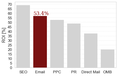
Let’s make this figure even more aligned with our ficticious narrative. In particular, you may have noticed that our y-axis is unlabelled, and perhaps we’d like to emphasize that e-mails in particular have a return-on-investment of over 50 percent.
So let’s actually add the text back, but only the important part. I’m also going to change the colours, firstly because I don’t find the red and green combination particularly appealing, but additionally, making the other columns light grey visually sends them to the background, thereby further emphasizing the importance of the red column:
colours = ["lightgray", "darkred", "lightgray", "lightgray", "lightgray", "lightgray"]

font = {'family': 'serif',
        'color':  'darkred',
        'weight': 'normal',
        'size': 16,
        }

fig, ax = plt.subplots(1, 1, figsize=(6,4))
# make the bar chart
sns.barplot(x=df.index, y=df.values, palette=colours, ax=ax)
ax.set_ylabel("ROI [%]")
ax.text(0.6, 58, "53.4%", fontdict=font)
Text(0.6,58,'53.4%')

A Note on Gridlines
As a final note, a short thing about gridlines. Gridlines can be incredibly helpful to guide the eye. However, be aware that different gridlines will emphasize different parts of your data visualization. Generally, widely spaced gridlines emphasize large-scale differences (like above for the OMB and the direct mail). If you’re interested in emphasizing smaller changes, you might want to use a narrower spacing between gridlines in order to make it easier for readers to see small changes (e.g. between “email”, “PPC” and “PR” in the figure above):
import matplotlib.ticker as ticker


fig, ax = plt.subplots(1, 1, figsize=(6,4))
# make the bar chart
sns.barplot(x=df.index, y=df.values, palette=colours, ax=ax)
ax.set_ylabel("ROI [%]")
ax.text(0.6, 58, "53.4%", fontdict=font)

ax.yaxis.set_major_locator(ticker.MultipleLocator(5))

Again using the concepts of gestalt, we can see that while these gridlines give us finer resolution, they also take up more visual space. We can place them in the background by adjusting their color and weight.
sns.palplot(sns.color_palette("Greys"))
fig, ax = plt.subplots(1, 1, figsize=(6,4))
# make the bar chart
sns.barplot(x=df.index, y=df.values, palette=colours, ax=ax)
ax.set_ylabel("ROI [%]")
ax.text(0.6, 58, "53.4%", fontdict=font)

ax.yaxis.set_major_locator(ticker.MultipleLocator(5))
sns.set_style({'grid.color': '0.5', 'grid.linestyle': ':'})

This figure might be less exciting than the infographic above, but it is much more straightforward to read and understand, and much more informative with respect to the narrative we want to present.
Alternative Text
As a last step, remember that some of your readers might be using screen readers. Compose an informative alternative text (e.g. for websites) or figure caption that allows users with screen readers to get the gist of what you’ve plotted, ideally along with a link to a machine-readable version of the data.
For example, my Markdown alt-text for the website version of this figure reads: “bar chart for return on investment for different types of marketing strategies, e-mail highlighted in red at second place with 53.4% return on investment”.
In a paper, I might caption this like this: “This figure presents our results for the return on investment (ROI) for different types of marketing strategies, as a bar chart. While Search Engine Optimization (SEO, left-most bar) has undoubtedly the highest ROI, our results show that e-mail (highlighted in red) follows closely behind with 53.4% ROI, leaving behind PPC, PR, Direct Mail and OMB.”
Exercise
Build your own narrative or data visualization! You can make up your own narrative to convey with this data, or you can choose one of the other visualizations in the Gallery in Wireframing a Visualization exercise. Then choose a type of data visualization, a set of colours and other elements of your figure accordingly! You can explore the data visualization catalogue for different types of visualizations to try out, and you can explore different combinations of colour palettes, intensities and values of transparency to help you emphasize the most important information. When you’re done, add your figure to this github repo by following the instructions on [this page]((http://dhuppenkothen.github.io/data-visualization-tutorial/14-exercisegallery/index.html).
Key Points
matplotlib and seaborn are powerful libraries for generating visualizations
Matching the type of visualization to your type of data can drastically improve readability
Choosing an informative and high-contrast colour palette can help make the figure viewable to a wide range of viewers